GUI Elements at a Glance
The option panel beside your 3D model is built from three kinds of pieces. Controls are what the shopper sets, ways to show a choice decide how a list of options looks, and elements arrange the panel and show everything around the controls. Below is each of them, as the panel draws it on the default theme; Style and Translations changes how they look, Layout where they go, and Controls explains what every control can do.
Controls
A control is what the shopper sets: each one has a key, and its value drives the model, the price and the order.
Dropdown
One choice from a list that opens on a click. It takes the least room, so it suits long lists.

Radio
One choice, every option in view. Drawn as plain text by default, or in any of the displays below.

Checkbox
Any number of choices from a list, each with its own price when it has one.

Switch
On or off, for one feature a shopper adds or leaves out.

Range
A number picked with a slider, between a minimum and a maximum, in steps.

Text
A line of the shopper's own words, such as a name to print or engrave.

Number
A number typed or stepped with the arrows, between a minimum and a maximum.

Colour
Any colour the shopper picks, for a part that can be painted freely.

Date
A day picked from a calendar, such as a delivery date.

Time
A time of day, such as a pick-up slot.

Email
An email address, checked as the shopper types it.

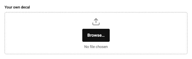
File
A file the shopper uploads, such as their own artwork for a decal.
Text area
Several lines of text, for notes or longer wording.

Button
A button that runs an action, such as showing a part up close or resetting the view.

Ways to show a choice
A radio, a checkbox or a dropdown can show its options in more than one way. Pick the one that looks most like the product.
Swatches
Each option as a colour, shown beside the choice's name.

Images
Each option as a picture.

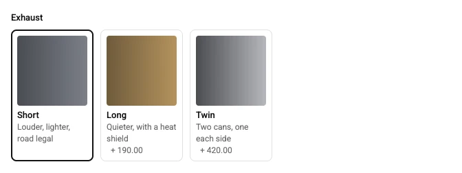
Cards
Each option as a card with its picture, name, description and price.
Buttons
Each option as a button in a row.

Pills
Each option as a small rounded label, for short names.

Dropdown list
A dropdown whose options open as a list with their prices.

Dropdown images
A dropdown whose options open as pictures.

Dropdown cards
A dropdown whose options open as cards.

Elements
Elements arrange the panel and show everything around the controls: groups, text, pictures, the price and the buttons that buy.
Section
A group with a heading and an optional description; what it holds is laid out one under the other.

Row
Lays what it holds side by side, wrapping onto a new line when there is no room.

Accordion
A group that opens and closes on its title, so a long panel stays short.

Tabs
Several groups under one strip of tabs, one shown at a time.

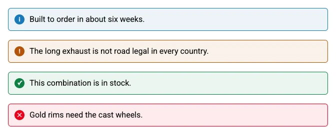
Message
A notice in one of four colours: information, a warning, a success or an error.
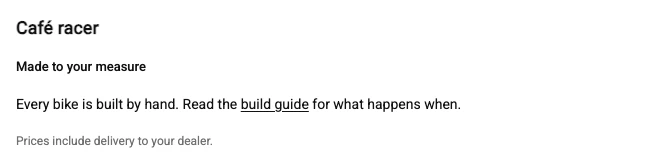
Text
Words of your own, as a heading, a subheading, body text or a caption. Write a link as the label in square brackets followed by the address in round ones.
Image
A picture with an optional caption.
Divider
A line, or empty space, between two parts of the panel.

Parts list
What the configured product is made of, part by part with quantities, live as the shopper chooses.

Price
The price of the configuration as it stands, with its breakdown if you show one.

Quantity
How many of the configured product the shopper buys.

Add to cart
The button that puts the configured product in the cart, with its configuration.

Confirmation
What the shopper sees after adding to the cart: a heading and a message of your own, in place of the panel or under it. It shows on the storefront once something is added, so it has no picture here.
Validation summary
Every choice still missing or wrong, each a link to its control.

Download PDF
A button that downloads a summary of the configuration as a PDF.

Link
A link to another page, as text or as a button.

Custom HTML
Markup of your own, cleaned of anything that could run, with its own styles.

Camera controls
Buttons and sliders that zoom and turn the view, for shoppers who would rather not drag.

Verified against the product in October 2026