Common Settings
This guide explains the settings that appear on more than one 3D Bits surface in the Shopify theme editor. Read it alongside the page for the specific block you are configuring: the block pages cover what is unique to each one, this page covers what they share.
Overview
The 3D Bits app ships six theme app extension surfaces, not four. Here is how each one is labelled in the theme editor:
| Shown in the theme editor as | What it is |
|---|---|
| 3D Bits - Auto 3D on product pages | The app embed. You switch it on once under App embeds and it renders every published project on its own products. This is the recommended route. |
| BITBYBIT VIEWER | Renders a project's 3D view in a spot you choose inside a product template. |
| BITBYBIT GUI CONTROLS | Hosts one area of the option panel wherever you drop it. Pairs with a viewer block or the app embed on the same template. |
| BITBYBIT PREVIEW | Embeds a public project from bitbybit.dev in an iframe. |
| BITBYBIT RUNNER (legacy) | Runs an exported script directly in the template. It keeps working for existing setups, but it is no longer the recommended path. |
| BITBYBIT APPS | Runs an entire application of your own on the product page. Pro plan only. |
The app embed covers the large majority of setups, and everything you would otherwise set here is authored in the app instead. See Theme Blocks for when placing blocks by hand is actually worth it.
Many settings below are shared across these surfaces, which is why they are documented once here rather than repeated on every block page.
Dynamic vs. Global Settings
3D Bits settings reach the storefront by three different routes, and it is worth knowing which one you are looking at before you change anything.
Product-Specific Settings (Dynamic)
Some theme block settings hold plain text or a colour, and Shopify lets you point those at a product metafield instead of typing a fixed value. The block then renders a different value on every product that uses the same template. This is useful when:
- Different products need different 3D models
- Camera angles should vary by product
- Background colours should match product aesthetics
- Scene configurations differ between products
Which settings hold per-product values depends on the block:
- VIEWER: Model URL, Scene JSON Configuration, Camera Position, Camera Target, Background Color
- RUNNER: Public Script URL, Camera Position, Camera Target, Background Color
- PREVIEW: Model Preview URL
- APPS: Public Script URL
When you publish a Composer project, the app writes the model and scene settings onto every linked product for you. The manual metafield route below is for setups you are wiring yourself, or for a value the app does not publish.
Global Settings
Most settings are global: you set them once on the block, in the theme editor, and they apply to every product that uses that template.
- Runner CDN Link
- Camera Position (optional - can be product-specific for VIEWER/RUNNER)
- Camera Target (optional - can be product-specific for VIEWER/RUNNER)
- Background Color (optional - can be product-specific for VIEWER/RUNNER)
- Try to Prepend
- Prepend With Query Selector
- Remove Children Before Prepend
- Show Spinner
- Show Fullscreen Button
- Receive Input Names As Variants
- Input Collection Mode
- Enable Debug Mode
- Disable Inputs When Computing
- Theme buy buttons
- GUI area and Custom area id
The third route is the one that catches people out: for the app embed, most of these are decided by the project in the app, and whatever you type in the theme editor is ignored. See Settings the Project Overrides.
How to Link Settings to Metafields
To point a setting at a product metafield:
- Clear any default value from the setting field if one is present
- Click the cylinder icon on the right side of the setting
- Search for your metafield in the dropdown that appears
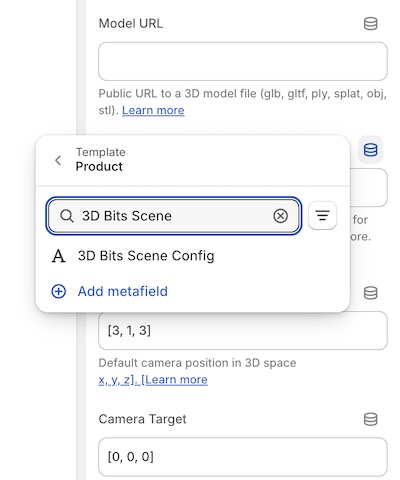
The search bar shows the product metafields available to your store. If you created the 3D Bits metafields from the app dashboard, they appear in this list. Metafields you defined yourself are available here too.
Setting up metafields:
You can create the app's metafields with one click from the 3D Bits app dashboard, or define your own through Shopify's metafield settings. Learn more about setting up metafields.
Once a setting is linked, you manage that value per product in Shopify's product editor rather than in the theme editor.
Settings by Block
This image shows where block settings live for the BITBYBIT VIEWER block. The other placed blocks keep them in the same place. The app embed is different: it lives under App embeds at the bottom of the theme editor's sidebar, not inside a template.
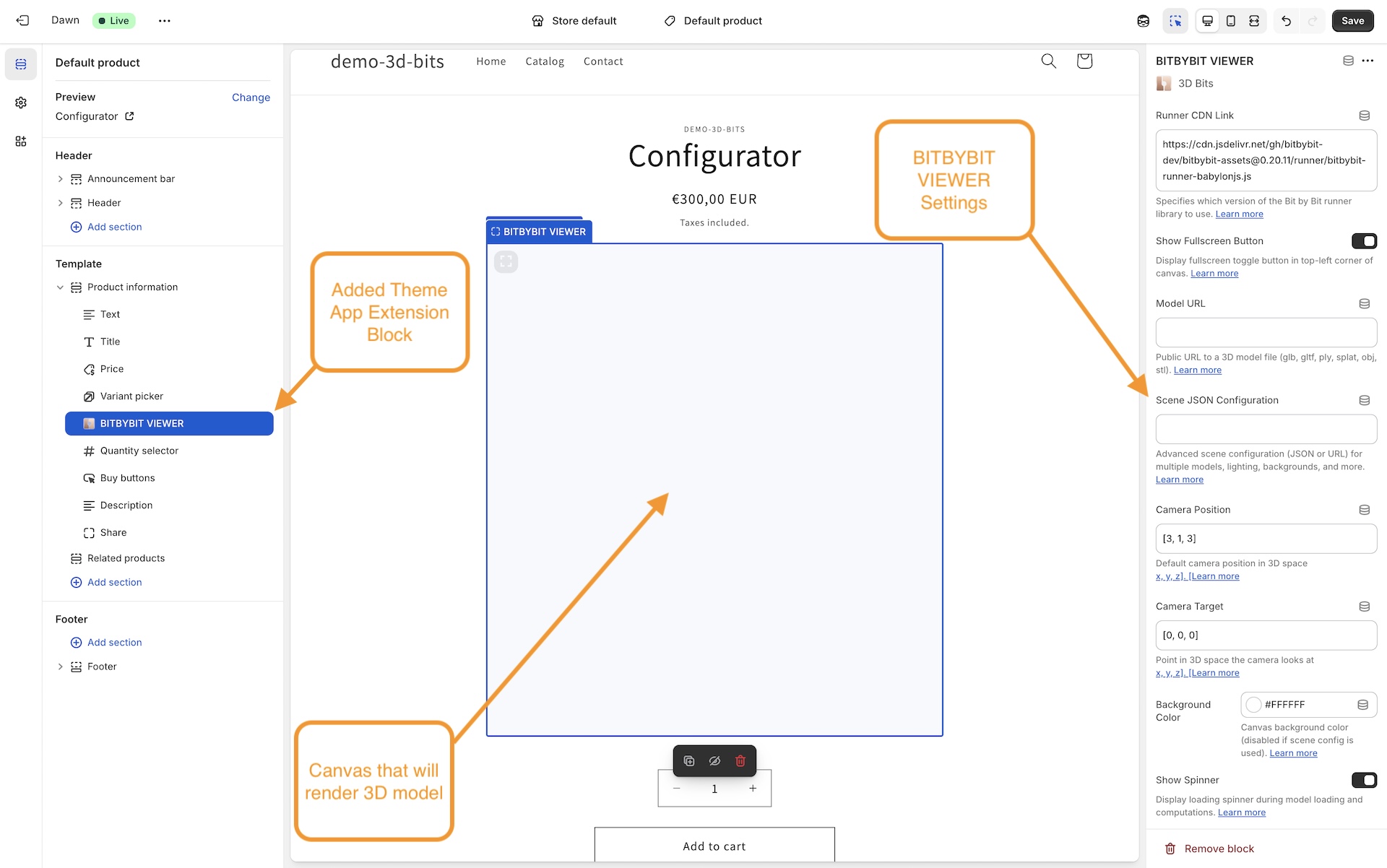
Here is the whole matrix. A tick in brackets means the setting is present in the theme editor but a published project decides the value instead.
| Setting | App embed | Viewer | GUI Controls | Preview | Runner | Apps |
|---|---|---|---|---|---|---|
| Placement (CSS selector) | ✅ | - | - | - | - | - |
| Runner CDN Link | ✅ | ✅ | - | - | ✅ | - |
| Show Fullscreen Button | (✅) | ✅ | - | ✅ | ✅ | ✅ |
| Show Spinner | (✅) | ✅ | - | - | ✅ | ✅ |
| Receive Input Names As Variants | (✅) | ✅ | - | - | ✅ | ✅ |
| Input Collection Mode | (✅) | ✅ | - | - | ✅ | ✅ |
| Enable OCCT / JSCAD / Manifold | (✅) | - | - | - | ✅ | - |
| Enable Debug Mode | - | ✅ | - | - | ✅ | ✅ |
| Disable Inputs When Computing | - | - | - | - | ✅ | ✅ |
| Try to Prepend | - | ✅ | - | ✅ | ✅ | ✅ |
| Prepend With Query Selector | - | ✅ | - | ✅ | ✅ | ✅ |
| Remove Children Before Prepend | - | ✅ | - | ✅ | ✅ | ✅ |
| Camera Position | - | ✅ | - | - | ✅ | - |
| Camera Target | - | ✅ | - | - | ✅ | - |
| Background Color | - | ✅ | - | - | ✅ | - |
| Public Script URL | - | - | - | - | ✅ | ✅ |
| Theme buy buttons | - | ✅ | - | - | - | - |
| GUI area / Custom area id | - | - | ✅ | - | - | - |
The App Embed
The app embed has nine settings, and only two of them are live for a project published by the current version of the app:
- Placement (CSS selector) - where the 3D view is inserted on each product page. It defaults to the add-to-cart form (
form[action*="/cart/add"]), which every theme has. To put the 3D in your gallery instead, enter that element's selector, for examplediv.product__media-wrapper. Documented on the App Embed page. - Runner CDN Link - which version of the runner and its assets load.
The other seven are described in Settings the Project Overrides.
The embed also does two things you cannot switch off from the theme editor. It always relocates the canvas to the placement selector, and it never hides the content already sitting there, so there is no Try to Prepend or Remove Children Before Prepend to set.
All Blocks (Viewer, Runner, Preview, Apps)
These settings appear on all four placed blocks:
The app embed has its own fullscreen setting and its own Placement field instead of the three prepend settings. The GUI Controls block has none of them - it never draws a canvas.
Viewer and Runner Blocks
These settings are shared by the VIEWER and RUNNER blocks:
- Runner CDN Link (also on the app embed)
- Camera Position
- Camera Target
- Background Color
Viewer, Runner, and Apps Blocks
These settings are shared by the VIEWER, RUNNER and APPS blocks:
- Show Spinner (also on the app embed)
- Receive Input Names As Variants (also on the app embed)
- Input Collection Mode (also on the app embed)
- Enable Debug Mode (on the app embed this is a project setting, not a block setting)
Runner and Apps Blocks Only
These settings are specific to the RUNNER and APPS blocks:
Viewer Block Only
One setting exists only on the BITBYBIT VIEWER block:
GUI Controls Block Only
The BITBYBIT GUI CONTROLS block carries no canvas settings at all. It has two:
Settings the Project Overrides
This is the single most common source of confusion, so it is worth stating plainly.
When the app embed renders a product, it reads the display settings that were published with that product's project and uses those. It falls back to the block setting only when the project has not published a value - and a project published by the current version of the app always publishes all of them. In practice these seven app embed settings do nothing:
- Show Fullscreen Button
- Show Spinner
- Receive Input Names As Variants
- Input Collection Mode
- Enable OCCT
- Enable JSCAD
- Enable Manifold
Change them in the app instead. Open the project and find the Storefront settings card. The first four are there under the same names, alongside Debug mode, which the app embed has no theme setting for at all. The three CAD kernels appear there only for a script project, because they are the kernels that project's script needs - a Configurator project does not use them.
Saving Storefront settings pushes the change straight out to the products already linked to that project. You do not need to publish again for it. A project that has never been published has nothing on its products yet, so publish it once first.
None of this applies to the placed blocks. A BITBYBIT VIEWER, PREVIEW, RUNNER or APPS block reads its own settings from the theme editor and nothing overrides them.
Setting Details
Runner CDN Link
Available in: app embed, VIEWER, RUNNER
Default: https://git-cdn.bitbybit.dev/v1.5.0
Specifies the CDN location from which the Bitbybit runner and all its assets (workers, WASM files, BabylonJS scripts, fonts, and so on) are loaded. The runner is the core engine that loads and renders 3D content in the browser.
This is one of the two app embed settings a project does not override, so if you are on the embed this is still the field to edit.
Accepted Formats:
This field accepts two types of value:
- Base URL (recommended): a URL pointing to the root of the assets folder, for example https://git-cdn.bitbybit.dev/v1.5.0 or https://cdn.yourcompany.com/bitbybit/v1.5.0/. The runner script path (
runner/bitbybit-runner-babylonjs.js) is appended automatically. A trailing slash is optional. - Full JS URL (legacy, backward-compatible): a direct URL to the runner JavaScript file, for example https://git-cdn.bitbybit.dev/v1.5.0/runner/bitbybit-runner-babylonjs.js. This format is still supported for existing configurations.
Why Base URL is Preferred:
When you provide a base URL, the system uses it for all assets - not just the runner script, but also the web workers (OCCT, JSCAD, Manifold), WASM binaries, BabylonJS engine files, physics engine and fonts. If you host assets on your own CDN, everything then loads from your infrastructure consistently.
With the legacy full .js URL, the runner script loads from the URL you gave and the base CDN is derived by stripping the known path. That works, but it is less explicit and only supports the standard runner path structure.
The Lighter Viewer Runner:
A configurator without scripts does not need the scripting engine or the CAD kernels, so it can load a lighter viewer runner (runner/bitbybit-runner-viewer-babylonjs.js) - the same 3D rendering at about half the download. The app embed and the VIEWER block pick it automatically when all of these are true:
- The runner link is empty, or a base URL on
https://git-cdn.bitbybit.dev/v...at a runner release that ships the viewer runner. The default link above does. Links pinned to an earlier release,latestand self-hosted links keep the full runner. - The product was published again after the app update that added the viewer runner. Publishing is when the app checks that the configurator has no scripts, so a product that has not been republished keeps the full runner.
- The block shows the product's published configurator. A scene config pasted into a VIEWER block keeps the full runner.
A disabled script still counts as a script, because a rule can run it. If a configurator gains a script after it was published, the storefront notices the script and loads the full runner on its own; publish again so the page asks for the right runner from the start.
To force the full runner on one block, paste the full runner's .js URL into this field, for example https://git-cdn.bitbybit.dev/v1.5.0/runner/bitbybit-runner-babylonjs.js. You can see which runner a page asked for in its source: the runner's script tag carries data-bb-runner-kind="viewer" or "full". The RUNNER block runs scripts, so it always loads the full runner.
When to Change:
Update this setting when you need features from a newer version of Bitbybit, when working with scripts created in a specific version of the bitbybit.dev editor, when you need to roll back to a previous version for compatibility, or when you want to host assets on your own CDN.
Why Manual Updates?
Runner versions are not updated automatically, to keep your live configurators stable. Web standards and 3D technologies evolve continuously, and the runner package integrates these technologies into a single, cohesive system. Automatic updates might seem convenient, but they can introduce breaking changes that disrupt live configurators without warning.
Manual version control gives you the chance to test an update in a safe environment before deploying it to production. That matters because a new runner version may include API changes affecting how your configurator logic talks to the underlying 3D engine. Managing updates yourself keeps service continuous for your shoppers.
Safe Migration Workflow:
When you are ready to update your runner version, follow this zero-downtime process:
- Duplicate your product that contains the configurator and set it to Draft status
- Create a duplicate of the product template and configure it to use the latest runner version
- Link the duplicated template to your Draft product
- Test thoroughly to ensure your configurator works as expected
- Deploy to production once testing confirms everything functions correctly
If issues arise during testing, your live products remain unaffected and keep serving shoppers without interruption.
Troubleshooting After Updates:
The resolution approach depends on which block type you are using:
For the app embed and BITBYBIT VIEWER:
- Open the project in Composer to identify and fix any broken settings
- The editor attempts to migrate configurations automatically when breaking changes are introduced to the scene format
- Use the visual interface to update any deprecated settings, then publish again
For BITBYBIT RUNNER:
- Open your scripts in the bitbybit.dev editors (Monaco, Rete or Blockly) to diagnose issues
- Address any errors caused by API version changes
- The web editors attempt automatic migrations during import, such as updating Bitbybit API function names
- Complex scenarios involving deeper game engine features may need manual intervention
While the editors provide automatic migration assistance, configurations using advanced features or direct game engine APIs may need manual review and adjustment. Test thoroughly after each update.
URL Format Examples:
Base URL format (recommended):
https://git-cdn.bitbybit.dev/v{VERSION}
Full JS URL format (legacy, backward-compatible):
https://git-cdn.bitbybit.dev/v{VERSION}/runner/bitbybit-runner-babylonjs.js
Self-hosted base URL:
https://cdn.yourcompany.com/bitbybit/v{VERSION}/
Replace {VERSION} with the desired version number (for example 1.5.0).
Self-Hosting Assets on Your Own CDN:
For production-critical applications, we strongly recommend hosting Bitbybit assets on your own CDN infrastructure. This brings several benefits:
- Reliability: your configurators keep working even if the Bitbybit CDN or its underlying provider experiences downtime
- Performance: choose a CDN provider optimised for your shoppers' regions
- Control: pin specific versions and manage updates on your own schedule
- Compliance: meet enterprise requirements for asset hosting and security policies
To self-host:
- Download the assets from the Bitbybit Assets Releases on GitHub
- Upload them to your CDN, preserving the folder structure
- Set the Runner CDN Link to your CDN's base URL (for example https://cdn.yourcompany.com/bitbybit/v1.5.0/)
When you provide a base URL pointing to your own CDN, all assets - the runner script, web workers, WASM files and engine dependencies - load from your infrastructure.
For a full guide on downloading assets, identifying which files you need, configuring CDN providers and testing your setup, see Hosting Bitbybit Assets on Your Own CDN.
If the primary CDN fails to load the runner script, the 3D Bits app attempts to load it from a fallback CDN automatically. That is a safety net, not a strategy. For mission-critical stores, self-hosting your assets is the most reliable approach.
Check the runner docs to learn more about how the runner works.
Visit Find Release Info on our GitHub to know which runner version is the latest.
Camera Position
Available in: VIEWER, RUNNER
Default: [3, 1, 3] (VIEWER), [30, 10, 30] (RUNNER)
Camera Position defines where the 3D camera sits in the scene's coordinate system. This determines the initial viewing angle of your content.
For the VIEWER block, if you are using Scene JSON Configuration, camera settings defined in the scene config take precedence over this setting. You can create and manage scene configurations using the Composer.
The app embed has no camera settings at all, for the same reason: every project it renders carries its own scene, and the scene owns the camera.
Format:
Provide a vector3 array in the format [x, y, z]:
- x - left/right position (negative = left, positive = right)
- y - up/down position (negative = down, positive = up)
- z - forward/backward position (negative = backward, positive = forward)
Default Values Explained:
- VIEWER
[3, 1, 3]: closer view, suitable for pre-made 3D models - RUNNER
[30, 10, 30]: further back, because parametric geometry often spans a larger area
Examples:
[3, 1, 3]      // Close view for product models
[30, 10, 30]   // Far view for large generated geometry
[0, 2, 5]      // Directly in front, elevated
[-2, 1, -2]    // Behind and to the left
[0, 20, 0]     // Top-down view directly above
Finding the Right Position:
- Start with the default values for your block type
- Adjust based on your content's size and orientation
- Combine with Camera Target to frame your content
Larger values move the camera further from the origin (0, 0, 0). If your content appears too small or too large, adjust the distance by scaling all three values proportionally.
Dynamic Camera Control (RUNNER only):
In the RUNNER block, your parametric scripts can also control the camera programmatically through both Low-Code (Blockly/Rete) and Pro-Code (TypeScript in Monaco). This lets you:
- Adjust camera position based on generated geometry size
- Create animated camera movements
- Define custom camera behaviour per variant
Camera Target
Available in: VIEWER, RUNNER
Default: [0, 0, 0] (VIEWER), [0, 15, 0] (RUNNER)
Camera Target defines the point in 3D space that the camera looks at. This is sometimes called the "look at" point.
For the VIEWER block, if you are using Scene JSON Configuration, camera settings defined in the scene config take precedence over this setting. You can create and manage scene configurations using the Composer.
Format:
Provide a vector3 array in the format [x, y, z]:
[0, 0, 0]      // Looking at the origin (VIEWER default)
[0, 15, 0]     // Looking 15 units up from origin (RUNNER default)
[0, 1, 0]      // Looking 1 unit up from the origin
[2, 0.5, 1]    // Looking at a custom point
How It Works:
The camera always points toward this target position. Combined with Camera Position, this defines the viewing angle:
- Camera Position = where the camera is located
- Camera Target = what the camera looks at
Default Values Explained:
- VIEWER
[0, 0, 0]: looking at the origin, where models are typically centred - RUNNER
[0, 15, 0]: a point elevated from the origin, suitable for parametric objects that extend vertically
Example Setup:
For a product sitting on a table:
// Camera Position
[3, 2, 3]     // Camera positioned above and to the side

// Camera Target
[0, 0.5, 0]   // Looking at the centre of the product
If your model is not centred at the origin, adjust the camera target to point at your content's centre. You can find the centre coordinates by loading it in 3D software like Blender.
Dynamic Control (RUNNER only):
Like camera position, your parametric scripts can control the camera target programmatically to frame generated geometry automatically.
Background Color
Available in: VIEWER, RUNNER
Default: #ffffff (white)
Sets the background colour of the 3D canvas. This creates the environment colour behind your 3D content.
For the VIEWER block, this setting is ignored if you are using Scene JSON Configuration. Scene configurations support richer backgrounds, including:
- Solid colours
- Linear gradients
- Radial gradients
- Background images
- Skyboxes (HDR environments)
You can configure these using the Composer. The app embed has no background setting for the same reason.
Usage:
Provide any valid CSS colour using the colour picker.
Examples:
#ffffff   // Clean white background
#f5f5f5   // Subtle grey
#f0f0f0   // Light grey
#2c3e50   // Dark blue-grey
#000000   // Dramatic black background
Best Practices:
Choose a background colour that:
- Matches your theme's design
- Provides good contrast with your 3D content
- Complements your product photography style
When to Change:
Match your theme's colour scheme:
- Light themes - white or light grey backgrounds
- Dark themes - dark grey or black backgrounds
- Brand colours - subtle brand-aligned colours
Neutral backgrounds (white, light grey) work best for showcasing 3D content, because they do not distract from the models or generated geometry.
Priority Order (VIEWER only):
Background settings are applied in this priority order, highest first:
- Scene JSON Configuration (skybox or advanced background)
- Scene JSON Configuration (background colour)
- This block setting
If you are using a scene configuration with a skybox or an advanced background, this setting is ignored.
Public Script URL
Available in: RUNNER, APPS
Default: Empty
Controls which script or application the block loads from an external source. This setting enables different workflows depending on the block type.
For RUNNER Block: Loads parametric scripts created in the bitbybit.dev editors (Blockly, Rete or Monaco). When empty, the block uses Inline Script instead.
For APPS Block:
Controls the three-mode development workflow (local development, preview, production). When empty, it defaults to https://localhost:4242 for local development.
Format:
Provide a fully qualified URL to your file:
https://example.com/scripts/my-file.txt
https://localhost:4242/assets/index-stable.js
https://cdn.shopify.com/s/files/1/xxx/index-hash.js
File Requirements:
- Publicly accessible (no authentication required)
- CORS-enabled if hosted on a different domain
- RUNNER: text/plain format, exported from bitbybit.dev
- APPS: an ES6 module JavaScript file compiled with Vite
Hosting Options:
- Shopify CDN - upload via Content → Files (recommended for production)
- The app's Assets library - upload in the 3D Bits admin and copy the URL
- Local Development - localhost:4242 (APPS only)
- Cloud Storage - AWS S3, Google Cloud Storage and similar
- CDN Services - Cloudflare, jsDelivr
- Your Own Server - any HTTPS server with CORS headers
CORS Requirements:
If hosting on a different domain, make sure the response carries proper CORS headers:
Access-Control-Allow-Origin: *
Access-Control-Allow-Methods: GET, OPTIONS
Access-Control-Allow-Headers: Content-Type
Block-Specific Usage:
For detailed usage instructions specific to each block, see:
- RUNNER: Public Script URL setting - script loading and priority
- APPS: Public Script URL setting - development modes and workflow
If you are writing parametric scripts for a store today, add them under Scripts in the 3D Bits admin and link them into a Composer project. You get the option panel, pricing and publishing around them, and you never paste a URL into a theme block. See Scripting.
Show Fullscreen Button
Available in: app embed, VIEWER, RUNNER, PREVIEW, APPS
Default: true
Controls whether the fullscreen toggle button appears on the canvas. When enabled, shoppers can click the button to enter and leave fullscreen.
Usage:
- Enable for immersive 3D experiences
- Disable if your theme handles fullscreen differently
- Useful for detailed product visualisation
The embed's copy of this setting is overridden by the project. Change Show fullscreen button in the project's Storefront settings instead - see Settings the Project Overrides.
Technical Note: the button uses the browser's Fullscreen API where the browser offers it. Where it does not, or where it refuses the request, 3D Bits falls back to a full-window CSS mode that looks the same to the shopper, and the Escape key leaves that mode. The PREVIEW block is the exception: it calls the Fullscreen API directly with no fallback, so on a browser without the API its button does nothing.
Show Spinner
Available in: app embed, VIEWER, RUNNER, APPS
Default: true
Controls whether a loading indicator appears while 3D content is loading or computing.
Usage:
- Enable to provide visual feedback during loading
- Disable if you have custom loading indicators
- Recommended to keep enabled
When it appears:
- App embed and VIEWER: while loading 3D models or scene configurations
- RUNNER: during script execution and geometry generation
- APPS: during application initialisation and data loading
Change Show loading spinner in the project's Storefront settings - see Settings the Project Overrides.
If a Composer project runs scripts, the Scripting tab has a separate While computing section with its own Show spinner toggle, an indicator delay so fast scripts never flicker the page, and an input debounce. Those apply to script runs specifically.
Receive Input Names As Variants
Available in: app embed, VIEWER, RUNNER, APPS
Default: true
Determines what 3D Bits calls each input it reads from the theme's own product form.
Options:
- Enabled (recommended): uses the input element's
nameattribute, falling back to itsid - Disabled: uses the text of the
<legend>inside the input's immediate parent, if there is one, and falls back tonameoridif there is not
Why this matters:
Technical names are more reliable because:
- They do not change when you update display text
- They are not affected by translations
- They stay consistent across theme updates
What "disabled" actually reads:
This is worth being precise about, because it is easy to assume the setting picks up whatever label is next to the field. It does not. It looks for a <legend> element inside the input's immediate parent - the pattern Shopify themes use for grouped variant radios:
<fieldset class="product-form__input">
  <legend class="form__label">Product Size</legend>
  <input type="radio" name="Size" value="Large" checked>
  <input type="radio" name="Size" value="Small">
</fieldset>
With the setting enabled, that group is reported as Size = Large. With it disabled, it is reported as Product Size = Large.
A <label> element is never used, and a field with no <legend> in its immediate parent falls back to the technical name either way - so disabling this on a theme that does not use fieldsets changes nothing at all.
Recommendation: keep it enabled unless a theme's legends are genuinely more stable than its input names.
Change Receive input names as variants in the project's Storefront settings - see Settings the Project Overrides.
This setting affects inputs 3D Bits reads from your theme. Controls that 3D Bits renders itself already carry a stable key you chose in the Composer, and are unaffected.
Dynamic IDs in Input Names
Many Shopify themes decorate input names and ids with a section id that changes whenever the theme is edited or the section is duplicated. For example:
<select id="product-form-template--15940235894834__main" name="Size"></select>
<input id="field-abc123XYZ-color" type="text">
Pin those down with a {{id}} placeholder rather than typing the id you happen to see today.
In a control's Selector field (Composer → Controls), write the placeholder in place of the changing part:
#product-form-template--{{id}}__main
input[name="option-{{id}}-size"]
[data-variant-id="{{id}}"]
Behind the scenes the placeholder becomes a "starts with" and "ends with" match on that attribute, so the first example looks for an element whose id begins with product-form-template-- and ends with __main.
The name inside the braces is yours to choose - {{id}}, {{sectionId}} and {{section_id}} all behave identically. Single braces such as {id} are not a placeholder and are treated as literal text.
A placeholder selector is only used when it resolves to exactly one element on the page. If two elements match - two sections of the same type on one template is the usual cause - the control finds nothing rather than guessing. Narrow the selector with a container, for example .product-form #field-{{id}}-color.
In a condition's input name (Logic, and the Visible when / Available when rules), a placeholder is matched against the names 3D Bits actually collected from the page, ignoring case. That is a different job from a selector, so the uniqueness rule above does not apply there - but a pattern loose enough to match several collected names is still worth tightening, because you cannot tell which one it settled on.
Publishing is blocked, not warned, if a {{id}} placeholder appears in a condition that gates a price. That covers the Visible when or Available when rule on a priced control or a priced option, a price formula's condition, and a part's Included when condition.
The reason is that checkout re-checks the price by looking up your controls by their exact keys, so a pattern that resolves on the product page has nothing to resolve against at checkout - display and enforcement would disagree. The publish message tells you which condition to fix and says the same thing: reference the control's stable key instead.
Placeholders remain perfectly fine anywhere money is not involved.
Use Enable Debug Mode to see the actual input names on your product page and work out which part of them changes.
Theme and App Updates
When you update your Shopify theme or a third-party option app (custom variant selectors, product customisers, advanced option apps), the input field names may change. That breaks any configuration matching on those names.
Recommended Update Process:
For Theme Migrations:
- Use Shopify's theme preview mode to test the new theme before publishing
- Enable Debug Mode on the product page template in preview
- Check the debug panel to see the new input field names in the updated theme
- Open Composer and use the option name edit feature to rename old input names to match the new theme
- Test all product variants thoroughly in preview mode
- Disable Debug Mode in the template
- Publish the new theme once everything is confirmed working
For Third-Party App Updates:
- Duplicate affected products and set the duplicates to Draft status
- Install or update the third-party app (or test different app versions on Draft products)
- Enable Debug Mode on the Draft product page template
- Check the debug panel to identify how the app's input field names differ
- Update your configuration in Composer using the option name edit feature
- Test thoroughly on Draft products to ensure configurators work with the new app version
- Disable Debug Mode in the template
- Apply changes to live products once testing is complete
Best Practice: testing in Shopify's theme preview mode for theme migrations, or using Draft products for app updates, ensures zero downtime and keeps a broken 3D viewer off your live pages during the update. Composer's option name edit feature makes bulk renaming quick across all affected configurations.
Third-party apps that modify product forms (variant selectors, product customisers, option apps) can change input names or values at any time, often without notice. When that happens your configurators break immediately on live product pages, which affects both the shopper experience and your sales.
To ensure maximum stability:
- Use trusted, established themes that keep consistent input naming conventions across updates
- For mission-critical implementations, consider having 3D Bits render the controls itself, so the keys are yours and nothing external can rename them
- Avoid heavy dependency on third-party apps that frequently change their DOM structure or input patterns
- Document your input naming patterns and watch for changes during any app or theme update
For Developers:
If you are building custom product forms or Shopify apps, follow our integration guidelines for developers to make sure your forms work reliably with 3D Bits. These cover input naming, value structures and event handling.
Partner App Integration:
We are working with partner app developers on dedicated integration strategies for popular Shopify apps. The first of these ships today as a Scraper Profile in the debug panel - see Future Compatibility.
Input Collection Mode
Available in: app embed, VIEWER, RUNNER, APPS
Default: standard
Controls which of the page's inputs 3D Bits reads and watches for changes.
Options:
- Standard Inputs: a fixed list of input types - radio, range, text, number, checkbox, colour, email, tel, url, date, time, datetime-local, month, week and file, plus every
<select>and<textarea> - All Inputs: every
<input>,<select>and<textarea>on the page, whatever the type
It is a natural assumption that Standard only looks inside the add-to-cart form. It does not. Both modes scan the whole page, including inside open shadow roots, which is what lets 3D Bits work with themes and option apps that use web components. The difference between the modes is only which input types are included.
What Standard leaves out is the machinery: hidden inputs, submit and button inputs, search boxes and any other type not in the list above. That is usually what you want, because those carry no shopper choice.
Use Cases:
Standard Inputs (recommended):
- Standard product pages with variant pickers
- Typical Shopify product forms
- Most setups
All Inputs:
- Custom forms with additional configuration fields
- Pages with non-standard input elements
- Integration with custom form builders that keep their state in hidden inputs
Performance Note: All Inputs can cost more on pages with a great many input elements. Use it only when you need it.
All Inputs picks up unrelated fields too - newsletter signups, search boxes, and any hidden field your theme uses for its own bookkeeping. Use Enable Debug Mode to check exactly what is being collected before you rely on it.
Change Input collection mode in the project's Storefront settings - see Settings the Project Overrides.
Future Compatibility
We are continuously improving 3D Bits support for popular third-party Shopify option apps.
The support that exists today lives in the debug panel rather than in this dropdown. Open Debug Mode, switch to the GUI Setup tab, and pick a Scraper Profile. The generic profile reads a plain product form; Easify Product Options understands that app's markup and produces cleaner controls from it. The panel then hands you the result as JSON to paste into the Composer.
As we add support for more apps, they appear in that Scraper Profile list.
Enable Debug Mode
Available in: VIEWER, RUNNER, APPS (on the app embed, it is a project setting)
Default: false
Shows a panel on the product page listing every input 3D Bits reads. It is the tool for integrating a third-party option app or a form of your own.
What the panel contains depends on which block drew it.
On the BITBYBIT VIEWER block and the app embed, which share the same runtime, the panel has two tabs:
- Live - a table of every option name and value 3D Bits is currently collecting, with a Copy button on each. This is where you find out what your theme actually calls a field.
- GUI Setup - scrapes the page's forms into ready-made 3D Bits controls, which you can edit inline and then take away with Copy JSON or Download. A Scraper Profile picker adapts the scrape to a known option app, and Refresh re-reads the page.
The GUI Setup tab says so itself: the titles it invents are guesses from your markup. Rename them to your own option names before you rely on them.
On the BITBYBIT RUNNER and BITBYBIT APPS blocks there are no tabs. The panel prints the inputs as raw JSON in the same place on the page - the RUNNER prints the collected inputs, the APPS block prints the collected inputs together with the block's settings. It still answers the question the Live tab answers, which is what your theme calls each field, but there is no per-row Copy button, no scraper and no GUI Setup tab.
Usage:
- Development: enable to troubleshoot
- Production: always disable on a live store
- Support: enable temporarily when working with 3D Bits support
Warning: the panel is visible to shoppers while it is on. Only use it during development or troubleshooting.
The app embed has no Debug Mode setting in the theme editor. Turn Debug mode on and off in the project's Storefront settings and Save - see Settings the Project Overrides.
When to Use
Enable debug mode when:
- Setting up a new block or a new project for the first time
- Configuring Receive Input Names As Variants
- Troubleshooting why option matching is not working
- Identifying input field names, including dynamic ids
- Testing Input Collection Mode settings
- Building a first set of controls from an existing form, using the GUI Setup tab
Example Debug Output
The Live tab lists names on the left and values on the right, which corresponds to a set of inputs like this:
{
  "color_variant": "red",
  "size_variant": "large",
  "material": "wood",
  "quantity": "1"
}
Usage Workflow
- Enable debug mode - in the theme block for a placed block, or in the project's Storefront settings for the app embed
- Visit your product page
- Note the input field names and values on the Live tab
- Use those names in your configuration, or build controls from the GUI Setup tab
- Disable debug mode when you are done
Always disable debug mode before your changes go live. The panel is visible to every visitor and reveals technical details about your page structure.
Try to Prepend
Available in: VIEWER, RUNNER, PREVIEW, APPS
Default: false
Moves the 3D canvas to a different place on the page, chosen with a CSS selector.
Why use this:
- Position the canvas in the product media gallery
- Show 3D in place of existing product images
- Fit a specific theme layout
- Control canvas placement without editing theme code
How it works:
When enabled, the block looks for the element named in Prepend With Query Selector and inserts the canvas as that element's first child. If your selector matches nothing, the block does not wait for it: it falls straight back to the theme's add to cart form, form[action*="/cart/add"], so a mistyped selector leaves the canvas in the default place rather than nowhere. Only when there is no cart form either - a situation you get on themes that build the whole page in JavaScript - does it retry, once a second, up to ten times, before giving up and logging a warning to the browser console.
The PREVIEW block is the exception again: it looks once, as the page loads, and does not retry. If your selector points at something a script creates later, PREVIEW will miss it.
Example scenarios:
- Place the 3D canvas at the top of the product media gallery
- Show 3D in place of the main product image
- Insert the canvas into a specific theme section
Requirements:
- A valid query selector
- The target element must exist on the page, or the canvas falls back to the add to cart form
- Different themes need different selectors
The app embed always relocates the canvas, so it has no on/off switch. It has a single Placement (CSS selector) field instead, defaulting to the add-to-cart form rather than a gallery class, because every theme has one.
Prepend With Query Selector
Available in: VIEWER, RUNNER, PREVIEW, APPS
Default: div.product__media-wrapper
The CSS selector for the target element when Try to Prepend is enabled.
Common Selectors by Theme:
| Theme | Recommended Selector |
|---|---|
| Dawn | div.product__media-wrapper |
| Debut | div.product-single__photos |
| Brooklyn | div.product-single__photo |
| Custom | Inspect your theme to find the appropriate selector |
What is a Query Selector?
A query selector is a CSS-like pattern that identifies an HTML element on your page. It is the same syntax used in CSS stylesheets.
Default Value Explained
div.product__media-wrapper targets:
- A
<div>element - With the class
product__media-wrapper
This is a common class name in Shopify themes for the product image gallery area.
Common Selectors
/* By class name */
.product-images          /* Element with class="product-images" */
div.gallery             /* div with class="gallery" */

/* By ID */
#product-media          /* Element with id="product-media" */

/* By tag and class */
section.product-main    /* section with class="product-main" */

/* More specific */
.product .media-gallery /* .media-gallery inside .product */
Finding the Right Selector
- Open browser developer tools (F12 or right-click → Inspect)
- Find the element you want to target in the Elements/Inspector tab
- Look for the element's class or id in the HTML
- Test your selector in the browser console:
The first element it returns is the one the canvas will move into.document.querySelectorAll('your-selector-here')
Best Practices
- Be specific enough that the first match is the element you meant - if the selector matches several, the first one on the page wins, silently
- Prefer classes over ids when a theme generates ids that change
- Test on multiple products to ensure consistency
- Avoid overly complex selectors that might break with theme updates
Different Shopify themes use different class names. Check your specific theme's HTML structure to find the correct selector.
If the only stable handle you can find contains a generated section id, you can use the same {{id}} placeholder described in Dynamic IDs in Input Names inside a control's Selector field. The prepend selector itself is a plain CSS selector - give it a class or a container instead.
Example Selectors for Popular Themes
/* Dawn theme */
div.product__media-wrapper

/* Debut theme */
.product-single__photos

/* Brooklyn theme */
.product__main-photos

/* Custom theme - check your HTML */
.your-theme-class
This setting only takes effect when Try to Prepend is enabled.
Remove Children Before Prepend
Available in: VIEWER, RUNNER, PREVIEW, APPS
Default: false
When enabled, hides the content already inside the target element, so the 3D canvas stands alone there.
Use this when:
- You want 3D shown in place of the existing product images
- The target container has content that clashes with the canvas
- You need a clean space for the 3D canvas
Use with caution:
- Shoppers no longer see the standard product images in that container
- Consider what a visitor sees if the 3D fails to load
- Test thoroughly before enabling on a live store
On the VIEWER, RUNNER and APPS blocks the existing children are hidden with CSS rather than removed from the page, and only the ones present at the moment the canvas is moved in. Anything your theme adds to that container afterwards - a gallery that populates late, for instance - is not hidden. If the result looks wrong, that is usually why.
The PREVIEW block is the exception: it removes those children from the page outright, and only a page reload brings them back.
Typical workflow:
- Enable Try to Prepend
- Set Prepend With Query Selector to the target container
- Enable this setting to hide the existing images
- The canvas becomes the visible content in that container
Recommendation: only enable it if you are certain the 3D canvas should be the only thing visible in the target element.
Common Use Cases
Show 3D in place of product photos:
- Enable this setting
- The 3D canvas becomes the primary product visualisation
- The traditional photos are hidden
Add 3D as the first image:
- Disable this setting
- The 3D canvas appears first
- Traditional photos remain available below
When enabled, the existing contents of the target element stop being visible. Make sure you do not need that content on the page, or that it is duplicated elsewhere. On the VIEWER, RUNNER and APPS blocks they are hidden with CSS rather than removed; on PREVIEW they are removed outright.
Disable Inputs When Computing
Available in: RUNNER, APPS
Default: false
Disables the product form's inputs (variant pickers, quantity and so on) while a script or application is processing.
Why use this:
- Stops shoppers changing their mind mid-computation
- Avoids race conditions from several rapid changes
- Gives clear feedback that something is happening
User Experience:
- Input elements become visually disabled
- Shoppers cannot interact with the form controls
- Inputs re-enable automatically when processing completes
- Works alongside Show Spinner
Recommended for:
- Complex parametric scripts with long execution times
- Setups where rapid input changes cause problems
- Products with many interdependent options
- Configurations that need sequential processing
Not recommended for:
- Fast-executing scripts (under about 100ms)
- Simple product variants
- Anywhere the experience depends on immediate responsiveness
Technical Note: this appears only on the RUNNER and APPS blocks, which run code supplied through the theme editor. It is not that a Composer project cannot do the same - it can. A project that runs scripts has its own Disable inputs toggle on the Composer's Scripting tab, next to an indicator delay so short computations never lock the form at all. The PREVIEW block runs nothing of yours, so it has neither.
Theme buy buttons
Available in: VIEWER
Default: Auto (recommended)
Decides how much of the theme's own buying interface gets out of the way when 3D Bits is doing that job instead.
| Option | What it hides |
|---|---|
| Auto (recommended) | Hides the theme's add-to-cart button and its accelerated checkout buttons when your configuration renders its own add-to-cart. Hides only the accelerated checkout buttons when the configuration saves data onto the order. Otherwise hides nothing. |
| Always hide | Hides the theme's add-to-cart and accelerated checkout buttons, whatever the configuration does. |
| Hide all product option controls | The above, plus the theme's variant pickers and quantity input, for a page where 3D Bits owns every choice. |
| Never hide | Leaves the theme entirely alone. |
The cart form itself stays intact underneath in every mode, so the theme keeps working.
On the block it is Theme buy buttons. The same setting on the app's Storefront page is called Theme product controls, and its four choices are worded differently: Smart - hide what the configurator replaces, Hide buy buttons and quantity, Hide default product details and Show everything, in that order. They map one-for-one onto the four above.
Shop Pay, Apple Pay and the other express buttons skip the line item properties that carry a configuration onto the order. If a shopper used them, you would receive an order with no record of what they configured. That is why Auto removes them as soon as your configuration writes order data, even when the theme's ordinary add-to-cart button is still the one being used.
The app embed applies exactly the same rule from the project's own settings, so there is nothing to set for it here. There is more on this setting, including when to move off Auto, on the BITBYBIT VIEWER settings page.
GUI area
Available in: GUI CONTROLS
Chooses which area of the option panel this block hosts. Elements are assigned to areas in the Composer, on the Layout tab, and each GUI CONTROLS block claims one of them and renders it wherever you have placed the block in the template.
The dropdown offers six areas: Main panel (all unassigned elements), the four canvas corners, and Buy area.
There is a seventh built-in area, the canvas centre, which the dropdown does not currently list. If you assigned elements to it in the Composer, type canvas-center into Custom area id instead.
Full detail is on the BITBYBIT GUI CONTROLS page.
Custom area id
Available in: GUI CONTROLS
Default: Empty
Overrides the GUI area dropdown with an area id you authored yourself in the Composer, for example area_x1. Leave it empty to use the dropdown.
Anything typed here wins over the dropdown selection, so clear it if you go back to a built-in area.
Best Practices
Development vs Production
During Development:
- Enable Debug Mode to see what 3D Bits reads
- Test Try to Prepend with different selectors
- Try both Input Collection Mode settings and compare the Live tab
In Production:
- Always disable Debug Mode
- Keep Show Spinner enabled for feedback
- Keep Receive Input Names As Variants enabled for reliability
Canvas Positioning
When using Try to Prepend:
- Find the correct selector for your theme
- Test on multiple product pages
- Verify responsive behaviour on mobile
- Consider what happens with Remove Children Before Prepend
- Write down your selector choices for future reference
Performance Optimization
- Use Standard Inputs mode unless you specifically need the rest
- Enable Disable Inputs When Computing for slow operations
- Keep Show Spinner on so shoppers know something is loading
Consistency Across Blocks
If you place several 3D Bits blocks in one store:
- Keep the shared settings consistent, so the experience matches
- Use the same prepend selectors across blocks
- Keep debug and spinner behaviour the same everywhere
And if you are on the app embed, remember that consistency is handled for you: the settings come from each project, so the same project behaves the same way on every product it is linked to.
Related Documentation
For block-specific settings, see:
- App Embed
- BITBYBIT VIEWER Settings
- BITBYBIT GUI CONTROLS
- BITBYBIT RUNNER Settings
- BITBYBIT PREVIEW Settings
- BITBYBIT APPS Settings
For setup and configuration:
Support
If you need help with common settings:
- Check the FAQ
- Contact support through the Shopify app dashboard or directly at [email protected]
- Visit bitbybit.dev for additional resources